
Color is an integral part of our lives and design is no exception. Now, color isn’t the only element of interior design that is important, as things like texture, spacing, usage and other elements also play an important role. However, it is color that helps to tie all these elements together and helps bring design to life.
Black and White

Perhaps the most “classic” of all color combinations is none other than black and white. This is for a good reason: it ALWAYS works.
Black and white is commonly seen together in tile patterns, art or accents and even overall color schemes for entire rooms. Using a black and white color scheme is the simplest way to give your home a clean and simple, yet sophisticated feel.
This feeling usually results because black and white allows for the true features of the room to stand out and be the stars of the show. They provide a backdrop for you to proudly display those pieces you own that deserve attention, whether it be art, photography or a collectible item.
Neutrals

There is a wide range of colors that can fall under the category of neutral colors. Don’t be fooled, neutral color combinations don’t have to be boring. For more on what’s possible with neutral colors, see Keep It In Neutral.
Common neutral color combinations that are timeless include: tan and white, beige and brown and gray and white (or black).
When working with neutral colors like these, it is important to incorporate as many textures and patterns as possible (as seen in this bedroom photo) to help create depth and visual interest.
Others

Other timeless color combinations include red, white and black; pink and green; brown and baby blue; lavender and white; and blue and orange.
Feeling like you want to stretch outside the boundaries of “classic” color combos? Try experimenting with more eccentric pairings that still work well together.
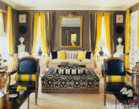
Consider the black and yellow combination pictured here. One of the primary reasons this works so well is because of the neutral colors that serve as the backdrop. The taupe walls, the cream colored floors and sofa along with the white pedestals and other accessories are reserved enough to let the bright pops of yellow stand out without clashing with the other elements in the room.
How to Use the Colors
Not sure where to begin in your selection of color palettes for your home’s interior? Decorating with Color – Creating Color Palettes is a great place to start. If you’re completely unsure about colors, give Decorating with Color – Color Theory a look. It will provide you with a solid understanding of the color wheel and how colors work together.
The primary types of color palettes include analogous, complementary and tone-on-tone.
Even if you’re not looking for an adventurous color scheme like the black and yellow one above, one color in your color palette is going to stand out more than the others. The key is to find the 2 or 3 colors that are going to serve as the background for the one standout color in the palette you’ve selected.
—
Design trends will come and go, as they always have. If you’re not one to chase trends, however, there will always be color combinations that are truly timeless. This is because these classic combinations will never go out of style. When paired with the right elements, they’ll be anything but boring.